


Shoppers decide if they want your product in about three seconds. They don't read the title first. They don't check the price. They look at the photo. That one image carries the first impression of your whole brand.
Here's the good news: great product photos aren't about expensive cameras or fancy studios. They come from a few smart choices done well. Good lighting. The right angle. A clean background. A consistent look across your catalog.
This guide gives you 20 product photography tips that work on any budget and any platform. Each one is short, practical, and ready to try on your next shoot.
Why Product Photography Is Crucial for E-Commerce
Online, shoppers can't touch your product or hold it up to the light. The photo has to do all that work for them.
A sharp, honest image answers the questions a buyer would normally ask in a store — how big is it, what's the real color, does it look cheap up close. A weak photo leaves those questions hanging, and most people just close the tab.
Bad photos also quietly drain your money through returns. If a mug looks cream in the photo but ships beige, the buyer feels misled, sends it back, and leaves a bad review. Showing real color, scale, and texture upfront stops that cycle before it starts.
There's a bonus most sellers overlook: photos affect search ranking. Amazon, Pinterest, and TikTok all watch how often people click your listing and stick around. Better photos earn more clicks, which pushes you higher in results — free visibility from one good shoot.
What You Need for Product Photography
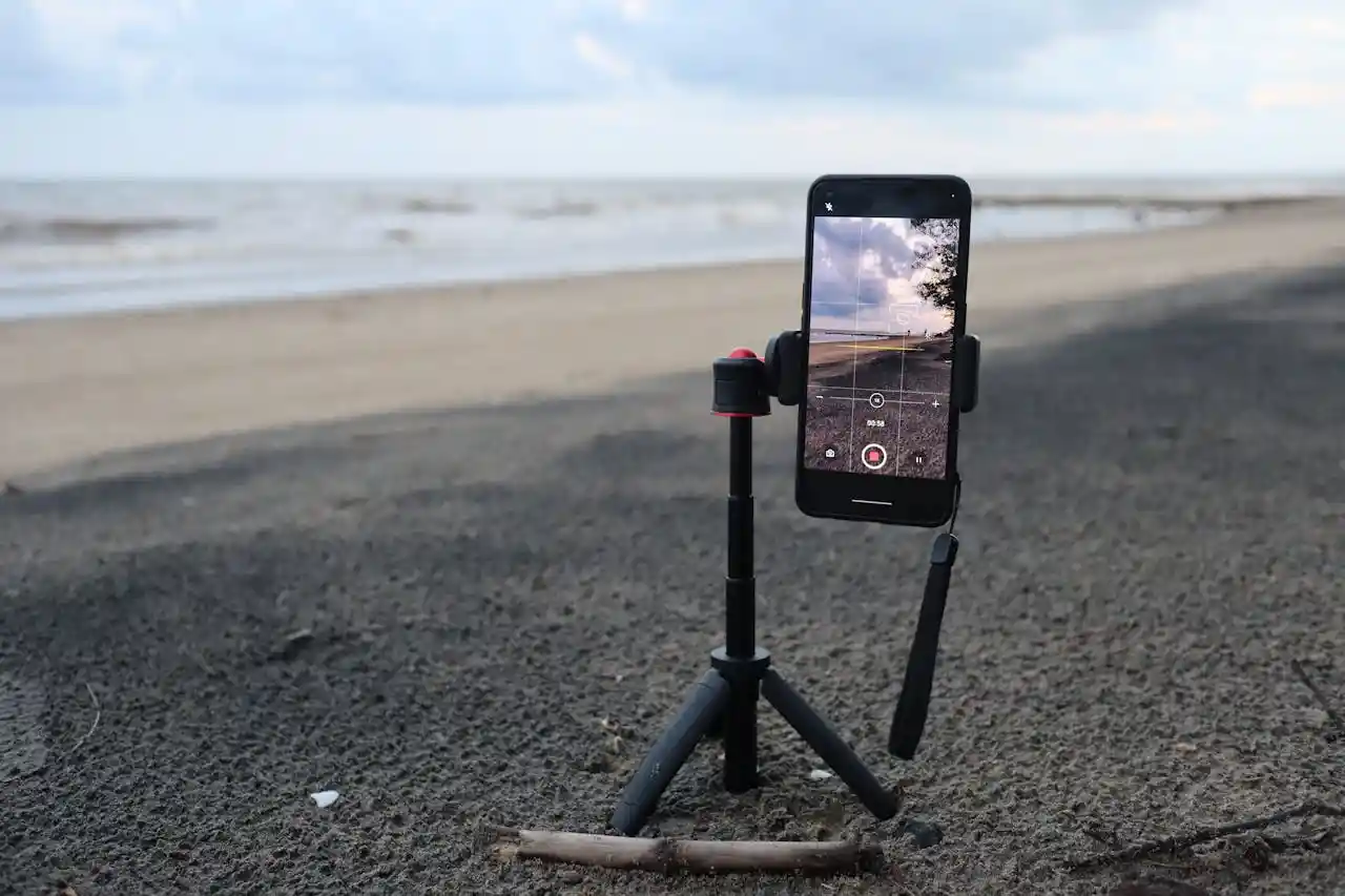
Honest truth: most gear lists online are written by people selling gear. You can shoot great product photos with stuff already in your house—a window, a table, and your phone cover the first 90%.
Spend money where it shows up in the photo. A $15 tripod beats a $300 lens for beginners because shaky hands are your real enemy, not resolution.
Skip the ring light too—it flattens products and leaves weird circle reflections on anything shiny.
Here's the short list that actually earns its shelf space:
- White poster board (backdrop and reflector in one)
- A tripod or phone clamp—any brand works
- A lint roller—saves you 20 minutes of editing later
- One free editor: Snapseed on phone, GIMP on laptop
Buy the rest only after a real photo problem forces your hand.
20 Product Photography Tips for High-Quality Photos
1. Shoot Tethered to a Laptop
Looking at a 3-inch camera screen hides every flaw. Run a USB cable from your camera to a laptop and shoot into Lightroom or Capture One.
You'll catch crooked labels, dust, and bad focus while the product is still set up — not after you've torn down the lights.
2. Use a Gray Card on the First Frame
Place an 18% gray card next to your product and take one shot. That single frame becomes your color reference for the whole batch.
One click in Lightroom matches every other photo to it, so your reds aren't pink in shot 4 and orange in shot 12.
3. Stop Your Product from Rolling with Museum Putty
Round things wobble. Bottles tilt. A pea-sized blob of museum putty under the base holds anything in place and doesn't show in the photo.
Photographers have used this trick for decades, and it beats stacking erasers or folded paper behind the product.
4. Light the Background Separately
Most beginners light the product and hope the background looks white. It won't — it'll come out gray. Aim one light at the product and a second light directly at the backdrop.
The background turns pure white in-camera, and you save 20 minutes of masking per photo.
5. Skip the Lightbox for Anything Bigger Than a Mug
Pop-up lightboxes flatten everything and add a faint blue or green tint from the cheap fabric. They're fine for tiny items but kill texture on shoes, ceramics, or skincare bottles.
A window plus one bounce card outperforms a $60 lightbox for most products.
6. Build a Black Flag for Shape and Depth
Pure white light from both sides makes products look flat. Stand a piece of black foam board just outside the frame on one side. It absorbs light and creates a soft shadow edge along the product, giving it dimension without needing more gear.
7. Focus Stack Small Products
At close range, even f/11 can't keep a whole ring or watch sharp from front to back. Take 5 to 10 shots, shifting focus a tiny bit each time, then blend them in Photoshop or Helicon Focus. The final image is razor-sharp everywhere — the standard for jewelry.
8. Shoot Slightly Above Eye Level for Most Items
A camera placed exactly at the product's middle hides the top surface, which is usually where the brand, label, or interesting detail lives. Drop the camera 10 to 15 degrees lower than the top of the product. Buyers see the front face and the top together.
9. Use Continuous LED, Not Flash, While Learning
Flash gives one frozen moment you can't see until after the shot. Continuous LED panels show you exactly what your shadows and highlights look like before you press the shutter. You learn lighting faster because the feedback loop is instant.
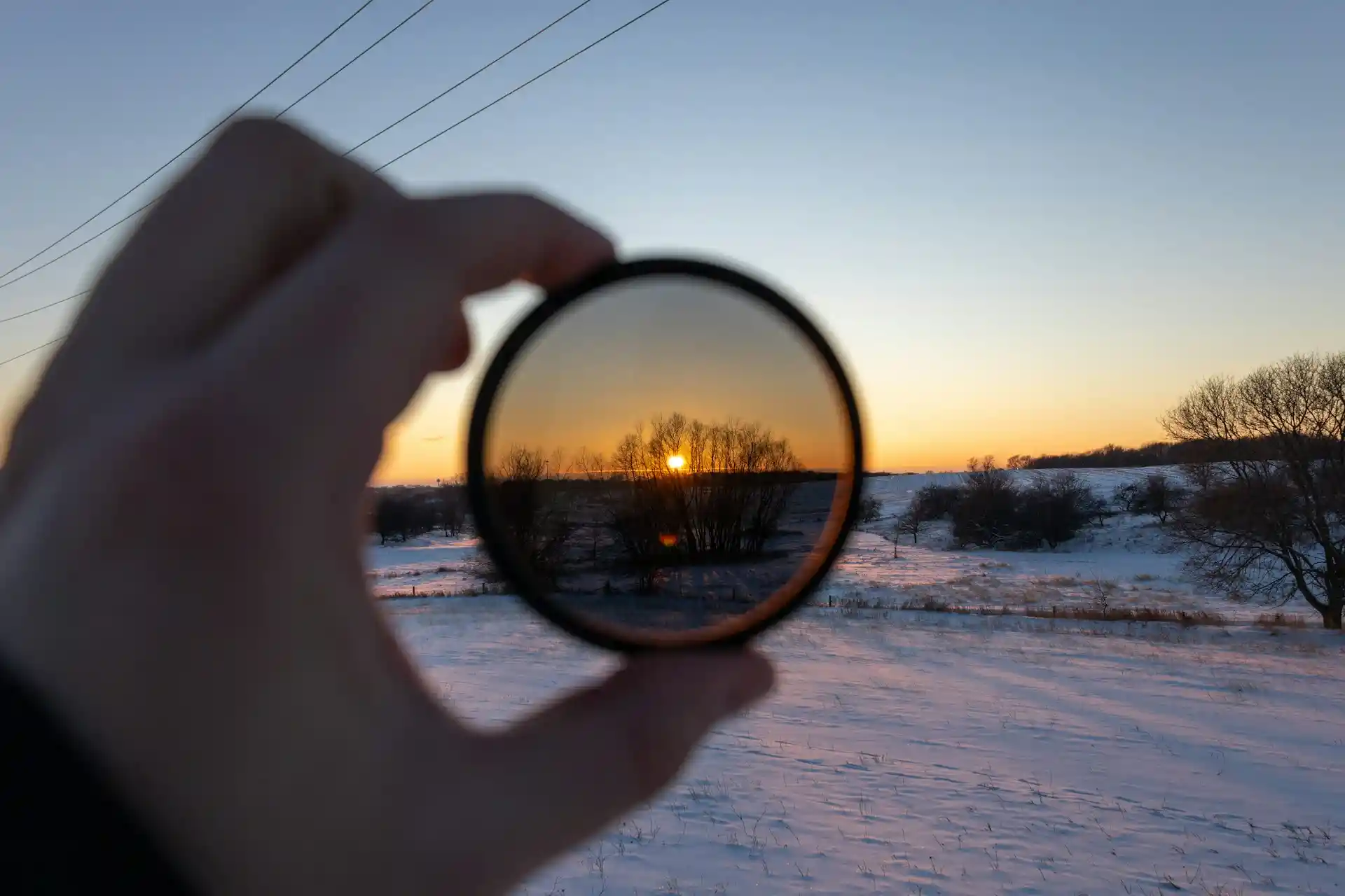
10. Kill Reflections with a Polarizing Filter
Glossy boxes, glass jars, and laminated labels throw glare straight into your lens. A circular polarizer screws onto your lens and rotates to cut that glare out. It's a $40 fix for a problem most editing software can't fully solve in post.
11. Mist Fabric and Produce with a Spray Bottle
Cotton looks dull on camera, and fruit looks plasticky. A few light sprays of water bring fabric to life and make produce read as fresh.
For drinks, mix water with a drop of glycerin — the droplets stay round on the glass instead of running off in 30 seconds.
12. Photograph Glass on Black, Not White
White backgrounds turn clear bottles into invisible blobs with a label floating in space. Switch to a black background and light the glass from behind with white cards.
The edges glow, the liquid color pops, and the shape finally reads — the technique every beverage brand uses.
13. Steam Clothing the Night Before, Not the Morning Of
Wrinkles you ignore in person become canyons on camera. A handheld steamer takes 10 minutes per garment, but fabric needs a few hours to fully relax and hang straight.
Steam the evening before your shoot so creases are gone, not just softened.
14. Match Your Camera Height to the Product Type
Tall bottles photograph best from chest height. Flat items like wallets want a top-down view. Shoes look right from about six inches off the floor.
There's no single "correct" angle — match the camera to the shape so the silhouette reads instantly at thumbnail size.
15. Add a Scale Reference in One Shot
Buyers constantly return items because "it was smaller than I thought." Include one photo with a hand holding the product, or with a coin or ruler next to it.
This single image cuts size-related returns more than any other change you can make to a listing.
16. Save Lightroom Presets Per Product Category
Skincare needs cool, clean tones. Leather goods want warm shadows. Food needs saturated reds and greens.
Build one preset for each category and apply it to every shot in that category. Your catalog stays cohesive, and editing time drops from 10 minutes per photo to about 30 seconds.
17. Edit on a Calibrated Monitor
Your laptop screen probably runs too blue or too bright out of the box, so the photos you "fixed" look wrong on everyone else's screen.
A Spyder or Calibrite tool costs around $170 and re-calibrates the display in 10 minutes. Without it, you're editing blind.
18. Keep Shadows — Don't Erase Them
A common beginner habit is masking out every shadow until the product looks like a sticker.
Soft shadows under and behind the product tell the eye it has weight and sits in real space. Lighten them in editing if needed, but never delete them completely.
19. Export at 2000px on the Longest Side
This single number triggers zoom features on Amazon, Etsy, and Shopify, which boosts conversion.
Smaller files load faster but disable zoom, and bigger files just waste bandwidth without any visible improvement. Save as JPEG at quality 80 — the sweet spot for sharpness and file size.
20. Reshoot Your Top 10 Sellers Every Year
Lighting trends shift, screens get sharper, and your old hero shots start looking dated next to competitors.
You don't need to reshoot the whole catalog — just the 10 products driving most of your revenue. One day of shooting per year keeps your bestsellers from quietly losing clicks.
Can You Use AI to Optimize Product Photos?
Backgrounds and Scene Swaps
AI tools like Photoshop's Generative Fill, Canva AI, and Remove.bg can strip out a messy background in seconds and drop the product into a totally new setting.
One clean shot taken at a kitchen table can become a white-background listing image, a cozy living-room scene, and a Christmas-themed banner — all without renting a studio or buying props.
This is where AI saves sellers the most money, because a single shoot now feeds an entire year of marketing assets across different platforms and seasons.
Image Quality and Detail Repair
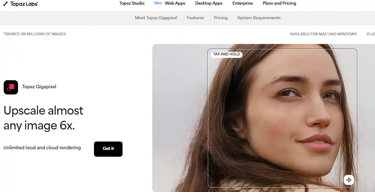
AI upscalers like Topaz Gigapixel and the free Upscayl can take a small, slightly blurry phone photo and rebuild it at 4x the resolution with sharper edges.
Other tools handle noise removal, motion blur, and even old, low-res supplier images that would normally be unusable.
For small sellers without a DSLR, this means a $0 phone shot can hit the same 2000px sharpness standard that Amazon, Etsy, and Shopify reward with zoom features.
Color Matching and Brand Consistency
Tools like Claid.ai and Pebblely are built specifically for e-commerce. Upload a reference image showing the brand's preferred tone, and the AI will adjust brightness, contrast, and color temperature across hundreds of product photos to match.
A store that used to look like a patchwork of mismatched shots starts looking like one cohesive brand. The real value is batch processing — what used to take a freelance editor a full week now runs in under an hour.
Generated Models and Lifestyle Scenes
Botika, VModel, and ZMO.ai can put clothing or accessories on AI-generated models of different ages, body types, ethnicities, and poses, all from a single flat-lay shot.
Sellers who can't afford a model casting suddenly have a full size range to show.
Other AI tools can place a candle on a styled coffee table or a blender in a bright kitchen, without the seller ever owning either setting.
Limits and Risks Worth Knowing
AI still messes up details that humans notice instantly — extra fingers, melted jewelry clasps, fabric patterns that drift mid-shirt, or text on packaging that turns into nonsense.
Photos that don't match the actual product lead to returns, bad reviews, and policy strikes. Amazon, Amazon EU, and several other marketplaces now require AI-generated images to accurately represent the real item, and some categories ban them outright.
Every AI output needs a human checking it before it goes live.
When to Use AI, When to Skip It
AI works well for background removal, upscaling, batch color correction, and generating extra lifestyle variations from a real photo.
It's risky for food, jewelry, skincare textures, and any category where buyers zoom in to judge quality — these still need real photography.
The most reliable workflow is hybrid: shoot one honest, high-quality base image of the actual product, then use AI to multiply that single shot into all the variations a modern storefront needs.
How to Create Product Photos for Different Platforms
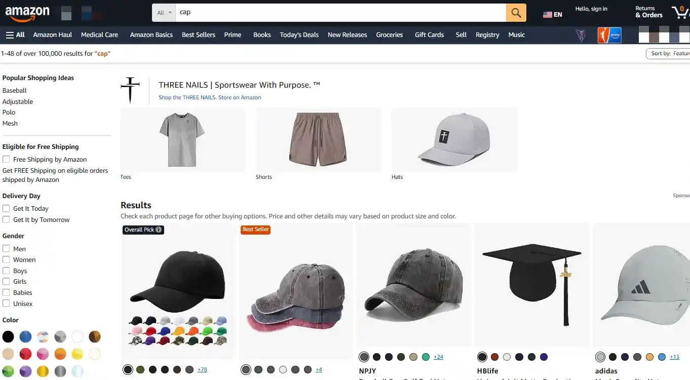
1. Amazon: The Strictest Rulebook
Amazon's main image needs a pure white background (RGB 255, 255, 255) and the product filling 85% of the frame, with no text, props, or renders. The catch most sellers miss isn't the rule itself—it's how the 85% is measured.
Amazon counts the product's bounding box, not the visible shape. A tall, thin bottle on a square canvas can look small even when it technically passes.
A second catch: "white background" includes the corners. Faint gray drop shadows or uneven lighting count as off-white and trigger the same auto-block. Running a color picker on a few random pixels before uploading saves a lot of takedowns.
2. Etsy: A Different Philosophy
Etsy doesn't require white backgrounds, but the more interesting fact is that overly polished, stock-photo-style images often underperform.
Buyers scroll past anything that looks too commercial because it breaks the handmade trust signal the platform runs on.
Two practical takeaways:
- Mix shot types in one listing (flat lay, lifestyle, scale shot, detail close-up) rather than five angles of the same setup
- Design the first image to read clearly at thumbnail size; collection grids on mobile shrink listings down to stamp-sized previews
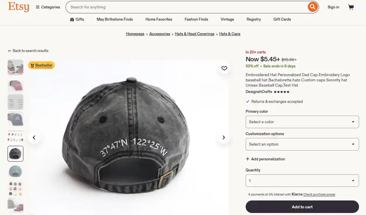
Source: DesignshCrafts
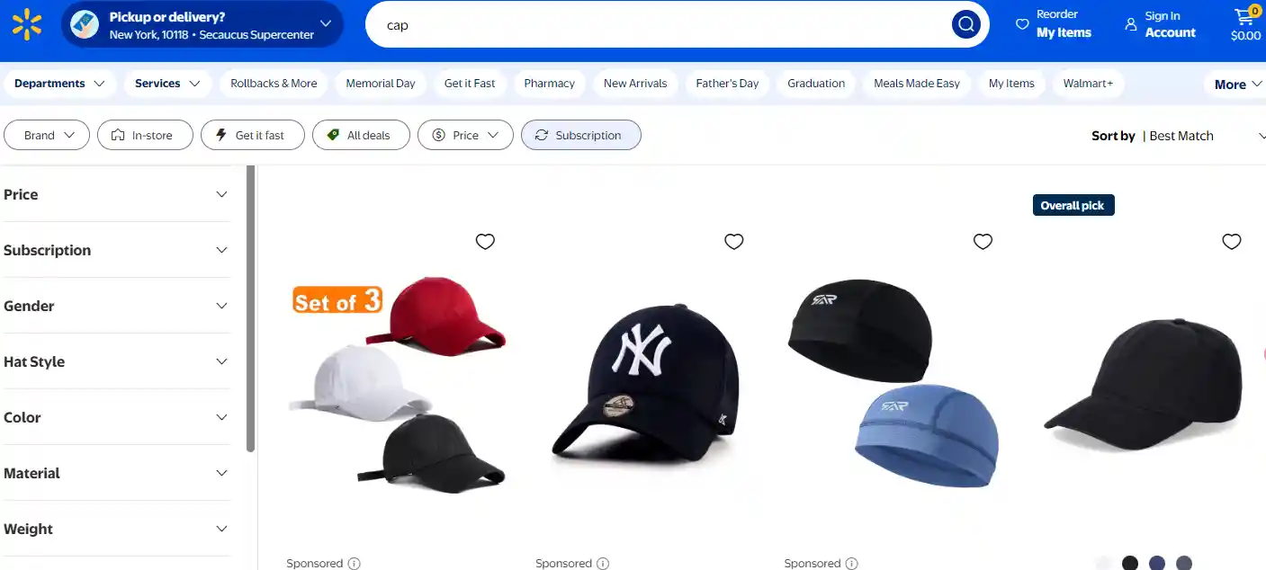
3. Walmart Marketplace, eBay, and Other Marketplaces
Walmart is tighter than Amazon in spots: at least four images, pure white background, and the product filling 95% of the frame.
That 95% rule punishes tall narrow products like perfume bottles or tools, which end up touching the top and bottom edges and looking cramped. Shooting on a wider canvas and cropping per platform avoids this.
eBay's rules look loose but reward quality quietly. Listings with sharper, larger images get pushed higher in search even when smaller ones are technically compliant.
Two side notes: eBay bans borders, watermarks, contact info, and text overlays, and Walmart's uploader often rejects iPhone HEIC files, so exporting to JPG first prevents silent failures.
4. Shopify, WooCommerce, and Other Direct-to-Consumer Sites
On a brand's own store, no one enforces anything—conversion data and brand identity do. The biggest hidden conversion killer is image mismatch between the collection page and the product page.
A shopper taps a top-down view, lands on a side angle, and bounces. Using the same hero image in both places solves most of it.
Two more details worth attention:
- File size matters more than dimensions: a 2MB JPG at 2048px loads slower than a 200KB WebP at the same size
- Alt text helps screen readers and ADA compliance, not only SEO; vague names like "IMG_0421.jpg" waste both signals
5. Social Commerce: TikTok Shop, Instagram Shop, Facebook Shop
TikTok's algorithm tends to bury video that looks like a commercial and reward what feels native—a phone-held demo, a casual unboxing, an awkward angle. Studio-perfect content often reaches fewer people than something filmed in a kitchen with bad lighting.
Two specifics that catch people off guard: Instagram Shop thumbnails crop from the center, so anything important near the edges disappears in the grid.
And TikTok's "thumb stop" happens in roughly the first half-second of a scroll, which means the opening frame matters more than the rest of the video combined.
6. Google Shopping and Paid Product Feeds
Google Shopping needs white or transparent backgrounds, one clear subject, and no promo text or watermarks.
The less obvious issue is using the same manufacturer-provided stock image as fifty other sellers. Google clusters identical images, and a listing ends up competing on price alone.
Two underrated moves: transparent PNG backgrounds render better than solid white on dark-mode search results, and seasonal badges like "Black Friday" or "Free Shipping" are the most common cause of ad disapproval because they feel too harmless to flag.
7. One Shoot, Many Platforms
The real bottleneck in a multi-platform shoot is rarely editing—it's the lack of a shot list before the camera comes out. Ten minutes of planning prevents hours of reshoots for an angle nobody captured.
A workflow that holds up across platforms:
- Shoot in RAW or 16-bit TIFF so the master file doesn't lose quality with each edit
- Export a 2000×2000 white-background master for Amazon, Walmart, and Google
- Add scenes, props, or text in Photoshop for Etsy and the brand's own site
- Re-crop to 9:16 and 1:1 for TikTok and Instagram, keeping the subject centered
- Name files by SKU and destination (sku123_amazon_main.jpg, sku123_tiktok_9x16.mp4) so the wrong version doesn't end up on the wrong store
8. Common Rejection Reasons and What They Actually Cost
The fix for a rejected image usually takes minutes. The real cost is the 24 to 48 hours the listing sits invisible while the new version goes through review, plus the dent on seller-health metrics that some platforms remember for months.
The pattern behind most rejections:
- Amazon "off-white" rarely means the whole background—it usually means faint shadows in the corners
- Etsy blurry thumbnails come from exporting JPGs under 2000 pixels, not from camera quality
- TikTok wrong-ratio rejections often happen when a 1:1 Instagram clip is reused without re-export
- Walmart low-fill flags trigger when packaging shots get uploaded in place of product shots
- Google Shopping promo-text bans catch seasonal badges more often than obvious sale stickers
Expert Tips
You've made it through all 20 product photography tips. Great product photos don't need a big budget or fancy gear.
Small changes make a big difference. Better photos mean more trust, more clicks, and more sales.


 Global Shipping


 Made in USA