


Have you ever designed something, printed it, and found that the print did not come out in the correct colors? Most often, the answer is summarized in one word: rgb vs cmyk.
These are two different ways to make colors. One is for the screen and only works with it, while the other refers to systems that print in full color. But if you use one incorrectly, your finished product will look different.
If you know these differences, it is possible to avoid such inconveniences. In this article, you will read all about the distinction between rgb and cmyk. Your printed items will look much better.
What is RGB and CMYK?
What is RGB?
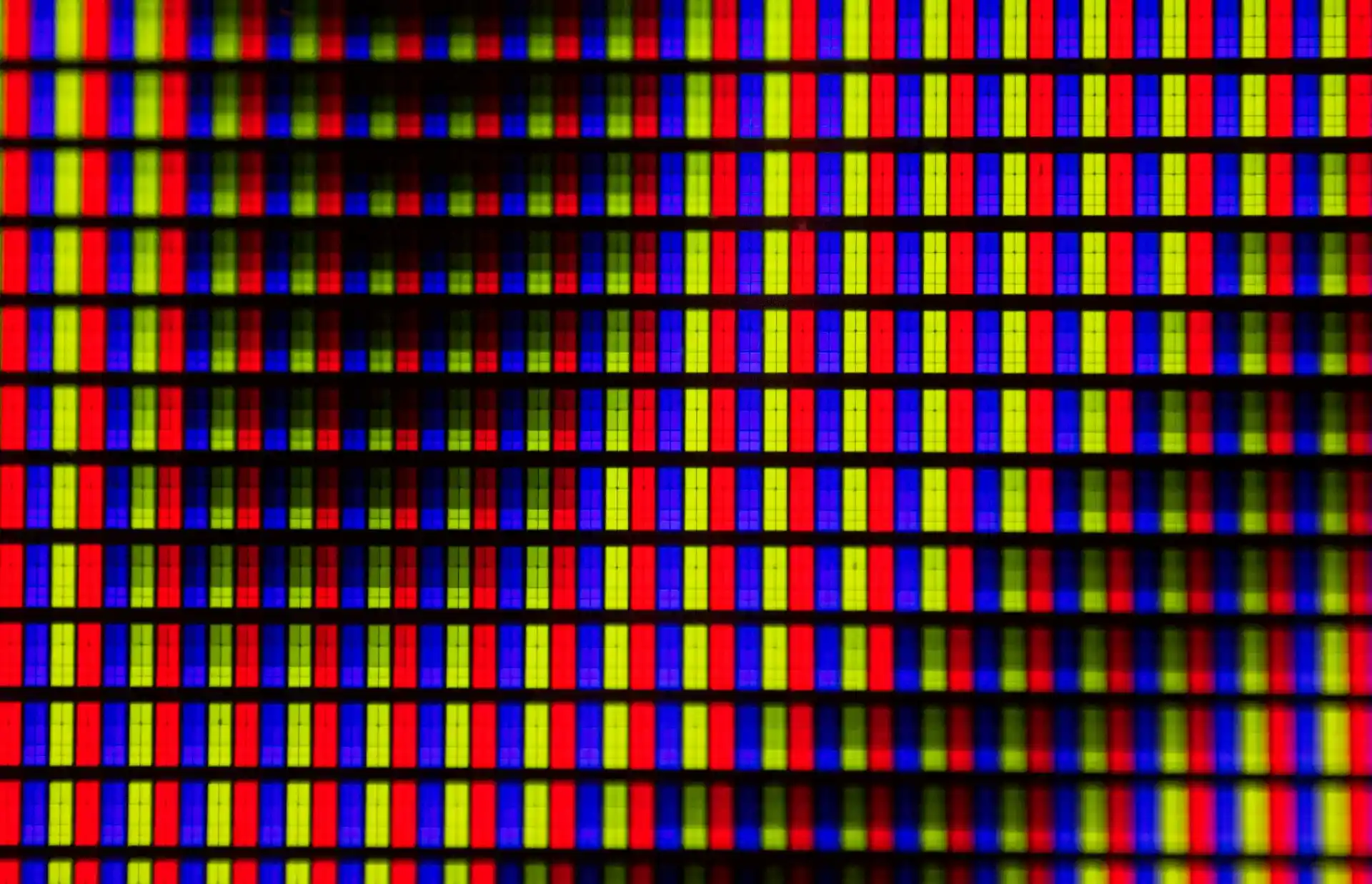
You run into RGB every time you look at a screen — phone, laptop, TV, anything digital. It stands for Red, Green, and Blue. These are the three colored lights that mix to make every other color you see online or on devices.
Screens start dark (no light) and add red, green, and blue together in different amounts. Full strength of all three makes white. That's why RGB is called an additive system. It produces very bright, saturated colors that pop on screens but often look flatter when printed because ink can't match those intense light-based shades.
What is CMYK?
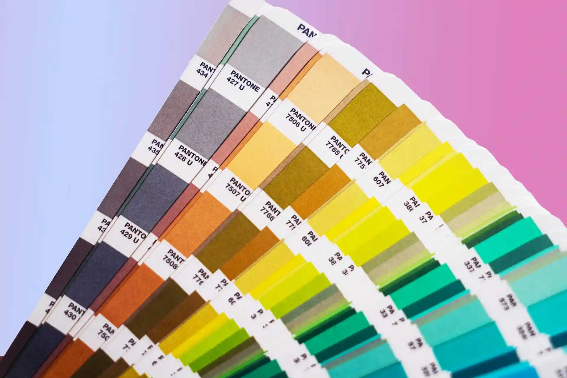
CMYK is what actual printers use. It stands for Cyan, Magenta, Yellow, and Black (the K is for "key" — the black plate).
Printing starts out with white paper. The printer lays down drops of these four inks that absorb light rather than reflecting it back.
Mixing any three of these inks will get you a very dark brown or black color, but the black ink by itself keeps shadows deep and type crisp without appearing muddy. It even does a good job on photographs.
The brighter screen colors must be toned down for paper, and that's often what you see in a printed CMYK file with its adequately prepared four-color separation sheets.
What is the Difference Between RGB vs CMYK?
How Colors Are Made
RGB
You build colors on a screen by mixing red, green, and blue light. The screen starts black and gets brighter as you add more light. Full amounts of all three make white. This additive mixing happens inside every digital display you use.
CMYK
You create colors on paper by laying down cyan, magenta, yellow, and black ink. The inks soak up light so the paper reflects less. Adding more ink makes things darker. This subtractive method matches how printing actually works.
Range of Colors You Can Get
RGB
RGB shows a bigger selection of colors. Bright pinks, electric blues, and glowing yellows look strong and pure on your screen. Many shades stay vivid only in this light-based mode.
CMYK
CMYK covers fewer colors overall. Some screen favorites fade or change when printed. Bright and neon tones usually lose intensity. You end up with a more limited, realistic palette.
Light vs Ink Behavior
RGB
Light adds up to make lighter colors. Zero light gives black. Higher numbers for red, green, or blue push toward white. This matches the way screens glow and catch your eye.
CMYK
Ink subtracts light to make darker colors. More ink means less reflection. The separate black ink handles deep shadows better than mixing the other three. This follows real paper printing rules.
Why Color Looks Different on Screen vs Print
Screens use RGB color mode, based on light. Printers use CMYK, based on ink. So colors look different on screen than in print.
Many printers accept RGB files, but colors may not print as you see on screen. A monitor cannot fully show the printed result, even in best cases. This is especially true for vibrant colors.
Today, RGB images often translate pretty close to CMYK. However, some images still have big differences. Bright and vibrant colors are most likely to change and not match.
When Should You Use RGB and CMYK for Your Designs?
At this point, use RGB any time you're looking at the screen. If it's a website, the pages of Instagram or TikTok, email campaigns, or online ad banners—in all such cases, you're better off with red-green-blue.
In this way, colors will give their brightest, clearest rendering. What you see on screen will look like something from your camera to viewers.
As soon as you know something's headed to press, turn to CMYK. That's true for any flyers, bumper stickers, book jackets, merchandise labels, or menu cards.
By starting here, you get immediate experience with how real color behaves on inks instead of wondering about changes later if something comes out wrong. If you draw in RGB and then switch to CMYK at the end, expect those brilliant bits to quiet down; often, they get quite tame.
Bright blues go flat, hot pinks lose their punch. To stay out of all such difficulties, change over to CMYK early in any physical piece. Then keep RGB for pure digital stuff only.
How to Convert Between RGB and CMYK
Prepare Your File First
Check your design software settings before converting. Make sure you work on a copy of the original file. Save the RGB version separately so you can go back if needed. This keeps your bright screen colors safe.
Use Software Conversion Tools
In programs like Photoshop or Illustrator, go to Edit > Convert to Profile or Image > Mode > CMYK Color. Choose a standard profile like U.S. Web Coated (SWOP) for most print jobs. The software shifts colors automatically to the closest CMYK match.
Check for Color Shifts
After conversion, look at bright areas like reds, blues, and greens. They often appear duller or change slightly. Compare side by side with the RGB version on a calibrated screen to spot big differences.
Adjust Problem Colors Manually
Fix shifted colors one by one using Hue/Saturation or Selective Color tools. Lower saturation on overly bright spots or boost specific channels. Make small changes and proof often to keep the design close to the original look.
Proof Before Printing
Always order a printed proof from your printer after conversion. Digital previews on screen do not match ink exactly. A physical proof shows real colors so you can make final tweaks if anything looks off.
How Color Modes Impact Printed POD Products
Screen Colors Look Much Brighter
You create designs in RGB, where colors appear very bright on your monitor. POD products use CMYK printing. Ink on fabric or paper absorbs light, so bright colors lose their glow. Neon shades and strong pinks often print much duller than they look online.
Vibrant Hues Shift During Conversion
RGB supports intense, saturated colors that stand out in digital mockups. When files convert to CMYK for print on demand, those colors change. Reds may lean orange, blues turn flat, and purples can look muddy. The print never fully matches the screen version.
Blacks Appear Less Deep on Print
RGB black is solid and rich with no light used. CMYK needs a dedicated black ink for true depth in POD products. Mixed blacks without it print brownish or weak. This affects dark logos, text, and backgrounds on t-shirts and hoodies.
Realistic Images Lose Some Warmth
The photos and skin tones in RGB have a natural look. In contrast, the ink in CMYK doesn't reflect as much light, which means that when printing photos of people, the skin tone will look flat or uninteresting. In addition, the shadows and highlights will not show as prominently.
Proper Setup Reduces Surprises
Many POD services auto-convert RGB to CMYK. Unprepared files cause unexpected shifts in final products. Starting in CMYK or using proof tools lets you see closer results before ordering. This helps control how your design prints on mugs, shirts, or bags.
Conclusion
If you design for print, always start in CMYK mode. This way, the bright colors you see on your screen are much closer to what you get on your product. It saves you time and money.
You don't have to worry about dull colors or messed-up text. Just set your file up correctly from the start. Then, your printed products will look exactly how you want them to. You are ready to create great print work.
FAQs
How many colors are in RGB vs CMYK?
RGB mixes red, green, and blue light to make millions of colors on screens. CMYK uses cyan, magenta, yellow, and black inks and can reproduce a much smaller printed color range.
What is a color profile (ICC profile)?
An ICC profile is a small file that tells devices how to interpret color. It helps align screens and printers so colors look similar across devices, improving predictability and consistency in prints.
What is the best color mode to use when printing?
The best color mode to use when printing is CMYK. This is because it works well with the combination of ink used when printing. It provides better predictable outcomes when printing. RGB works well when printing to screens but not when printing to paper.
Should I use RGB or CMYK for digital products?
The best option when creating digital products such as websites, apps, and social media content is to use RGB. This is because screens use light, and RGB provides brighter and more vibrant outcomes. The use of CMYK will not produce the same effect when printing to screens as it does when printing to paper.
Do I need to convert RGB to CMYK when printing?
Yes, you should convert RGB to CMYK when printing. This will allow you to make adjustments to ensure that the final outcome of printing matches the expected results. It will also ensure that you do not get unexpected outcomes due to colors that cannot be printed.


 Global Shipping